by leonor brilha
Prezi is a visually based presentation software that supports a non-linear storytelling approach to presentations. With many affordances, including the ability for the audience or presenter to zoom in and zoom out of the screen, Prezis can be powerful but they can also be problematic.
You may have used or seen a Prezi presentation. In case you’re not sure, Prezi is a presentation tool, that instead of following a linear format (slide after slide), it uses zoom and pan to connect the frames, changing not only the dynamics of a presentation, but also changing the way the audience makes connections between the ideas presented. Or at least, that’s what’s supposed to be the main advantage of using Prezi over other tools. However, as you may have seen, the zooms and pans are used by presenters only as fancy transitions between frames, with a lot of us in the audience left wondering, “What’s the point in all of this? All of this coming in and out of the screen, it’s so confusing. Should’ve just stuck to the good old slides.”
Below are some tips to support creating effective Prezi Presentation.
What many presenters don’t realize is that, when choosing one presentation tool over another one, you have to make the most of what it has to offer. Prezi’s strength is in its non-linearity, but that doesn’t mean that the frames should be displayed randomly on the screen. The non-linear flow allows for seemingly unrelated concepts to come together by making new meaningful connections between them. Meaning through visual metaphors can be created by significant (hierarchical for example) spatial positioning on the screen and differentiation or similarity of concepts can be achieved by exploring design elements (colors and shapes). The biggest lesson is to use less text and bullet points, and let the visuals and transitions tie in the concepts of your presentation.
Before starting work on Prezi:
- Think about what are the main goals of the presentation and what’s a good visual metaphor to represent it. This will be your main layout, which can be a path, map, tree, etc.
- Also take into consideration what kinds of connections are there between your ideas and design the frames in relation to the layout. Where on the layout does it make the most sense to place each frame? How does it connect with the frame immediately before and after it, and how does it connect in general with the other frames?
- Think about your presentation with a view of the whole in your mind, because at many times the audience will be able to see all the frames, and you want to draw the eye towards focus points.
- Think about what visual/temporal patterns you’re creating with your presentation and how that’s going to influence the pattern of thoughts and learning process in the audience.
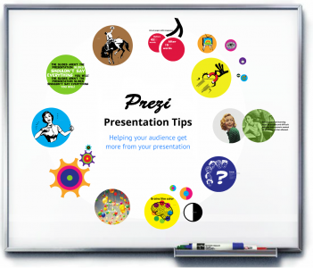
For a visual summary of these ideas and more tips for Prezi (made with Prezi!), please refer to this Prezi and video below it that walks through it.

